Staples
Improving reusable components
Creating design solutions for consistent, simple and efficient components.
About Staples
Staples is an office supply retail company. In addition to traditional office supplies, they offer furniture, technology and cleaning products. Staples operates two websites: Staples.com for consumers and StaplesAdvantage.com businesses.
The Challenge
The goal was to create visual consistency for our existing reusable components, to create design solutions to simplify the interface and make it less busy.
My Role
I was responsible for the User Experience (UX) and User Interface (UI) Design.
I Conducted/Designed
Competitive Analysis
Wireframe
User Interface Design
Visual Design
The Team
Director of UX / Director of Digital Experience / Senior Product Manager / Software Engineers / Quality Engineers / Senior Art Director
Guidelines for consistency
Four guidelines were established. The same specifications were applied to all components with minimal exceptions. These changes created visual consistency, simplified development and reduced confusion during QA.
Proposal
Prior to implementing the new guidelines, before and after mockups were created to obtain approval from stakeholders.
Vertical padding between components were inconsistent, resulting in unintentional grouping. One padding was proposed.
Multiple margins made an already content heavy page more busy. The new design had one margin with one exception. Components with wallpapers and single banners would be full width.
All gutters, vertical and horizontal, would be 12 px. Having one gutter simplified development and reduced confusion.
All corner radius’ would be 12 px, with the exception of full width components. These components would have a 0 px corner radius.
Components
The new guidelines were applied to 40+ components. Margins, paddings, gutters and corner radius’ were revised. These low effort changes made a big impact. The page is more consistent and polished.
Consolidated components
Four components with overlapping design elements were consolidated into one, creating visual consistency and reducing maintenance efforts for the development team.
1 Card, 4 Components
The new card is flexible and efficient. All design elements have the ability to be turned on/off as needed. If additional elements are needed in the future, they can be easily added.
The following design elements moved from inconsistent to consistent:
Headline
Gutter
Image ratio
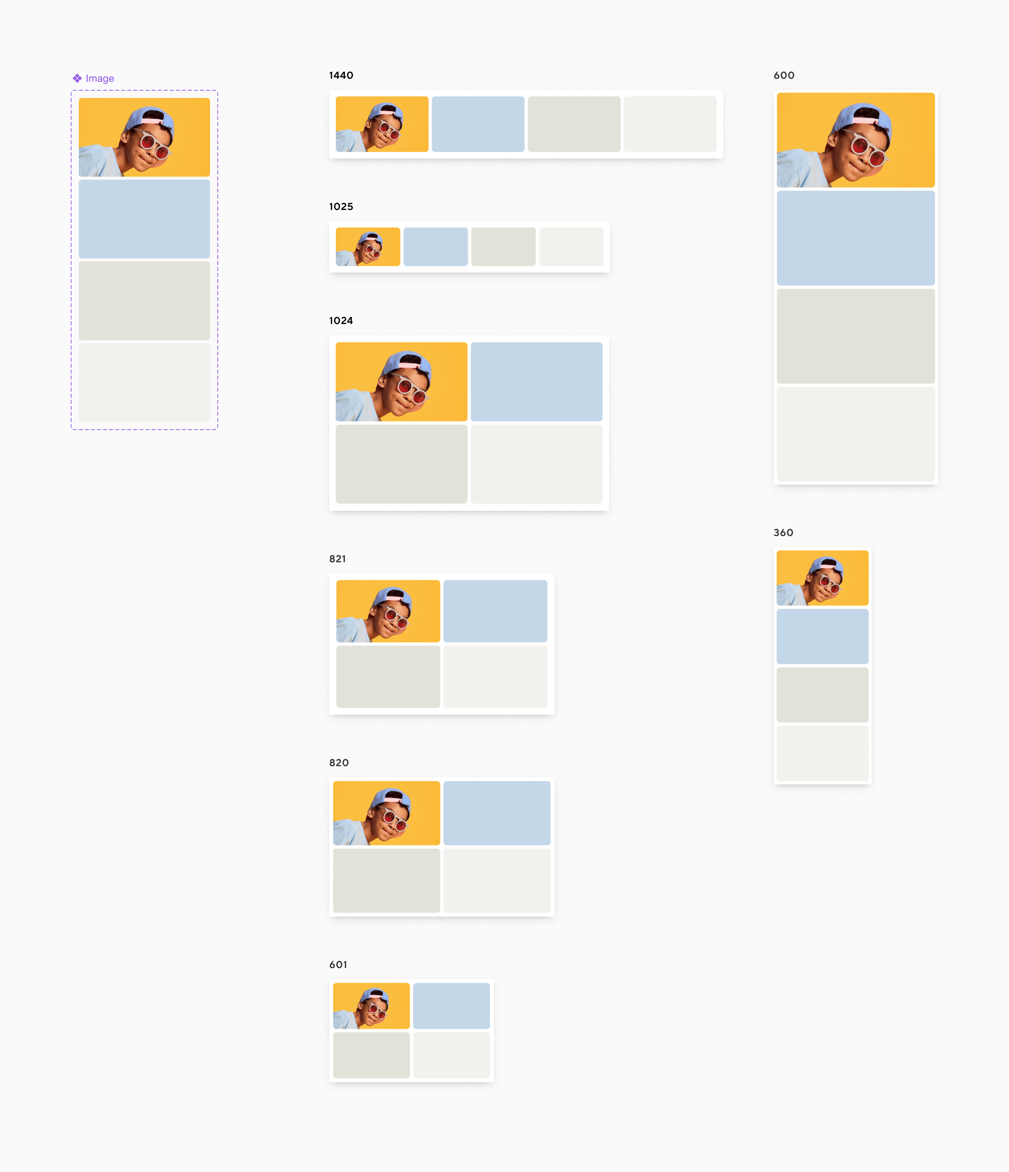
Drag & Drop artboards for efficiency
Drag and drop artboards were created for all components containing imagery. This feature was extremely helpful to designers creating assets. The team was able to quickly and efficiently mock up all breakpoints.
4 Across component
Each component has eight breakpoints. Previously, designers would gather image specifications from an Excel sheet and manually create each component. With this feature, assets can be dropped into the “Image” component on the left and will auto populate in all eight breakpoints.
Design Toolkit
Additional Work


