Genius
Designing a new website from scratch
Designed to be mobile-first, the goal was to design a fast user experience that is easy to use and efficient.

About Genius Delivery
Genius Delivery is an e-commerce cannabis company with a competitive advantage of fast delivery.
The Challenge
The goal was to create a fast user experience — a user flow and interface that allow recurring customers to quickly checkout, but was also easy to use and intuitive for new customers.
My Role
I was responsible for the User Experience (UX) and User Interface (UI) Design.
I Designed
User Flow
Wireframe
Information Architecture
Prototype
Interaction Design
User Interface Design
Visual Design
The Team
Director of Technology / Product Manager / Software Engineers / Creative Director
Design Process
Define
The goal
Ideate
User Flow
Wireframe + Information Architecture
Prototype Wireframe
Test with Stakeholders
Feedback + Iterate
Design
User Interface
Interaction
Visual
Prototype Interface
Test with Stakeholders + Users
Feedback + Iterate
Implement
Dev-ready Assets
QA
Site Map
Because there was a time constraint, only essential pages were included.
User Flow
The goal was to create the shortest user flow. By reorganizing the content, the user flow was reduced by two steps.
Original / Typical E-Commerce Flow
Final Flow
Wireframe + Information Architecture
The goal was to help users find information and complete tasks. Content was organized, structured and labelled to enable users to achieve their objectives in the best way possible.
When creating wireframes I always start by listing all the elements that need to be included on a page. Then I move onto sketches where I can quickly organize and structure the information before I move onto the computer to mock things up.
For each page, I started at a high level and worked towards the details.
Determined the main function of the page
Listed secondary elements that users may be searching for
Listed all other content that users may need to help them complete their task
Homepage
Main Function: Add products to bag
Secondary Elements: 1) Products/Services the site offered. 2) User’s delivery address and the ability to edit. 3) Delivery time. 4) Product categories. 5) Bag
Other Content: 1) Page header. 2) Footer
User Interface
The goal was to design fast interactions.
I anticipated what users might need to do and created elements to help them easily, quickly and efficiently complete those tasks.

Returning User
This is the landing page for returning customers. Anticipating that users typically get their orders delivered to the same address — the most recently used address is loaded by default.
Manually typing an address is time consuming. The user’s most recently used address is loaded by default.
If the user needs to enter a different address, a list of previously used addresses will be available to quickly select from.
Homepage
To shorten the user flow, all product cards were placed on the homepage. Users can quickly view all products without having to spend time entering and toggling between different category pages.
Categories were purposely listed in order of popularity since 4 out of the 7 labels are initially not visible.
Because the main function is to add products to the bag, the global navigation (product categories) and product cards were prioritized. The navigation is fixed to the the top while reserving the rest of the screen for viewing products.
On desktop, the “Quick Add” button is hidden under the roll over state. On mobile, it’s visible for easy accessibility.
Quick Add
Users can quickly add a product, change the quantity, and proceed to checkout — all from the homepage.
The “Quick Add” button allow users to quickly add a product without having to enter a product details page.
The popup allows users to quickly change quantity and/or checkout.
Through usability testing, we found that users did not see the “Quantity Updated” message when it was static. To solve this problem, the message was animated — the movement helped attract the user’s attention.
Checkout
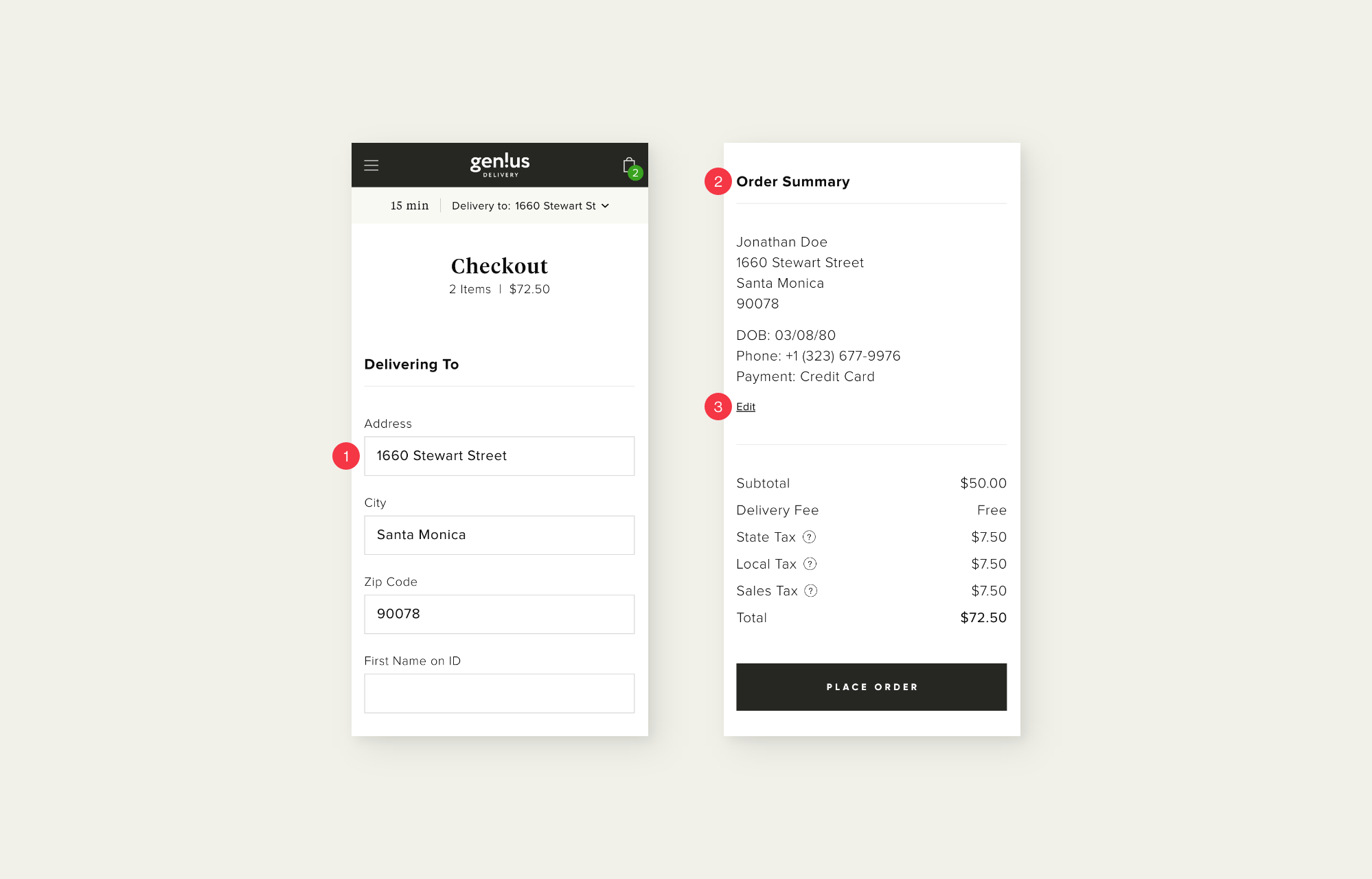
A single-page checkout flow requires less action from users.
To save time, the delivery address is autofilled.
The “Order Summary” allows users to review all their info without having to scroll up.
If users do need to make a change, clicking “Edit” will automatically scroll them back to the top, relieving them of manually scrolling.
The Brand
I worked with the Creative Director to develop the brand.
Brand Attributes
Modern
Simple
Casual
Approachable
Trustworthy
Colors
The site offers many products from different companies. A primary neutral color palette was chosen because it was ideal for housing many products with varying personalities.
Typography
Three typefaces were chosen — two san serifs and one serif. The san serif typefaces were chosen for its modern and simple look and feel. The serif typeface adds a sense of trustworthiness.
Other Components
Design Toolkit
Additional Work


